
What do you think of when seeing the colour red? You might never think about it, but colours are often associated with certain emotions and ideas. All the more reason for marketers and companies to carefully consider their way of branding. Probably the most recognizable and important within this section is the colour of the logo. These designs can make the difference between a successful enterprise and an unsuccessful one. This is because, believe it or not, colours have the magical powers to influence you as a consumer. Companies, therefore, exploit the synergy and dynamic between colours to convince consumers to buy their products.
In this blog, we are going to enlist the most used colours, their meaning, and which famous enterprises make use of these colours. Let it be an inspiration for your designs!
Red - the passionate, but dangerous colour
You are in a situation where you have to press one of three buttons, a red one, a yellow one, and a green one. Which would you definitely not choose? Your answer to this question is most likely the red button. Reason being, that the colour red reflects intense emotions. It is often associated with the terms energetic, suspense, passionate, and action. On top of that, red also reflects danger, Anger, and aggression.
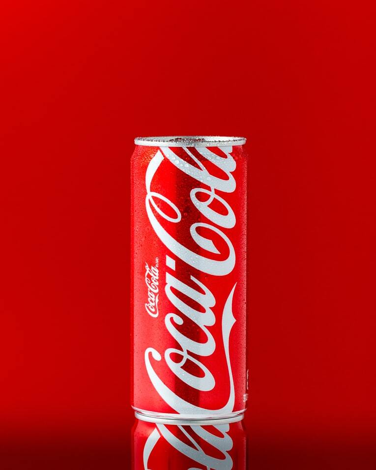
This intense colour is regularly used for branding in the food industry, but it is also a common choice for other brands. This is because the colour is associated with the feeling of passion and it can influence your appetite. Enterprises that use this fierce colour for their branding methods are, for example, Coca-Cola, Uniqlo, Nintendo, YouTube, and Netflix. Besides its common use within branding, red is also often used within traffic. For example, in traffic lights, rear lights of cars and bikes, and many road signs make use of the red colour.

Yellow - the bright and happy colour
The colour of the emoji, sun, and light. As you might have guessed, yellow is the colour of bright. It expresses accessibility, friendliness, happiness. It is, therefore, often associated with positivity, luck, friendliness, and optimism.
Enterprises implement these colours in their branding to look hip, young, energetic, and friendly. A few examples that use the happy colour for branding are Ferrari, Mailchimp, Snapchat, Mc Donalds, and DHL.
Green - the peaceful colour of nature
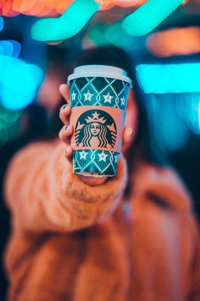
The colour that is used by companies such as, Heineken, Spotify, Animal planet, Starbucks, and Landrover, has a calming effect on people. Enterprises that strive for a better environment often choose the colour that mother nature reflects. However, it is also a common choice for profit-based companies. The reason is, green is not only associated with nature and health, but also with wealth and money.

Purple - the king's colour
This doesn't mean that the royal house always wears this colour, but it's commonly referred to as the colour of the royals. Mixing blue and red makes purple. Therefore, purple has both red's passionate personality and blue's calmness. Pink is the real ladies' colour, but purple is not an unpopular choice for a woman. One more reason why this colour is often referred to as the royal's colour is that it is often associated with power, flexicurity, nobility, spirituality, and wisdom. However, be careful to not overuse it, because purple can lead people to think of frustration and arrogance.
Enterprises that use this colour for their branding are, for example, famous streaming platform Twitch, Japanese search browser Yahoo, the premier league, FedEx, and Instagram.
Pink - the sweet colour
It's seen as a somewhat lighter version of red and for ladies, it often has the preference over purple. Pink is made by mixing red and white which is the cause of its softer feature. The colour is often linked with romance, sweetness, and femininity. There are some other aspects that people often think of when seeing pink, but these are the most characteristic for companies to use within their branding. To give you a few examples, Barbie and Victoria Secret make use of the femininity and romantic aspect of pink, while Hello Kitty and Donut King make use of the sweetness characteristic of the colour.

Blue - the intelligent colour
Some might associate blue with the term "feeling blue" which is used to express sad and depressed emotions. Furthermore, it is a phrase that is sometimes used within games as a joke. However, blue is normally not a colour that is linked with jokes. On the contrary, blue is known for being the colour to express its seriousness. It is often connected with intelligence, safety, wisdom, honesty, trustworthiness, and adulthood.
Accordingly, it should not come as a surprise that many companies want to express professionality by using this colour in their branding. Blue is the common choice for banks or companies that use payment as their income model. Examples are, PayPal, Visa, and The Bank of America. On top of that, is blue regularly used to convey a relaxed platform which is why many social media channels such as Twitter and Facebook make use of it. Lastly, blue is an intelligent colour, but also linked with professionalism. That's why, enterprises, that want to show that they have expertise within their field, frequently choose the colour blue within their branding. For instance, Oral-B, HP, Ford, and Philips are well-known implementers of the colour.

Brown - the colour of earth
Often seen as a boring colour. Accordingly, its implementation in branding, by itself, is quite uncommon, but some companies do use it in combination with other colours. Especially, companies that want to show their natural and organic character make use of this colour. It's for instance chosen by companies that produce products that use chocolate or cacao, such as M&M and Nespresso.
Grey - the neutral colour
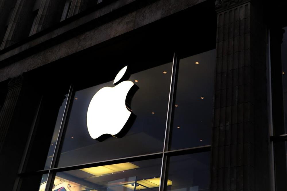
Even seen as a more boring colour than brown, is grey. Commonly associated with it are balance and neutrality. Therefore, grey is a colour that is rarely used as its main branding trademark. The most known ones that do implement the colour are Audi, Apple, and Volkswagen. This is not surprising since it comes with the characteristics of being conservative, formal, and boring.
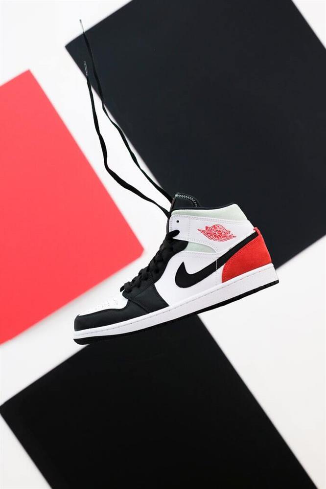
Black - the colour of the dark
This is an intense colour in contrast to grey. It's associated with dark thoughts, such as fear and death. Accordingly, overuse of it within branding isn't recommended since it could intimidate people. On the other hand, is black also a colour that shows power, authority, and elegancy.
These colours are, therefore, a common choice within branding. Enterprises such as Nike, Adidas, and Sony implement it to express overwhelming power in comparison to their competitors. On the contrary, clothing companies such as Zara or designer brand Gucci use it to convey its luxuriousness and elegance.

White - the father of all colours
White posses all colour attributes and all colours are created from it. It is, therefore, often associated with neutrality and balance like grey. Positively it's linked with the attributes of being modest, innocent, safe, perfect, and honest. However, in some cultures, such as in Japan, the colour is associated with the dead so doing some research within your target reason is important.
White is often used as a background colour in branding or as the colour of the letters in combination with black. In itself it doesn't express more than a white piece of paper, but effectively used in combination with other colours makes it a powerful branding colour. Vans, for instance, uses it to convey hipness, youth, and simplicity.

Orange - the choice of HappyPrinting
Orange is a colour that stands out. At HappyPrinting we have chosen the colour because it expresses the warmth and happiness of our company. Furthermore, it's a colour that shows enthusiasm, creativity, and adventure.
Orange is also the national colour of the Netherlands where we originate from. It's an effective colour to be different so creators generally seem to like this colour. The most common enterprises to use orange as a colour within their branding are Fanta, Nickelodeon, and MasterCard.
Understanding the depth of colours can make the difference between a successful brand and an unsuccessful one. However, colours are most effective when you can design them to be in perfect balance. What does your company stand for? Asking this yourself is the first step into creating your successful brand.
For all your printed matters you can contact us.
We print, you smile!